Monday, November 29, 2010

Univers VS Helvetica

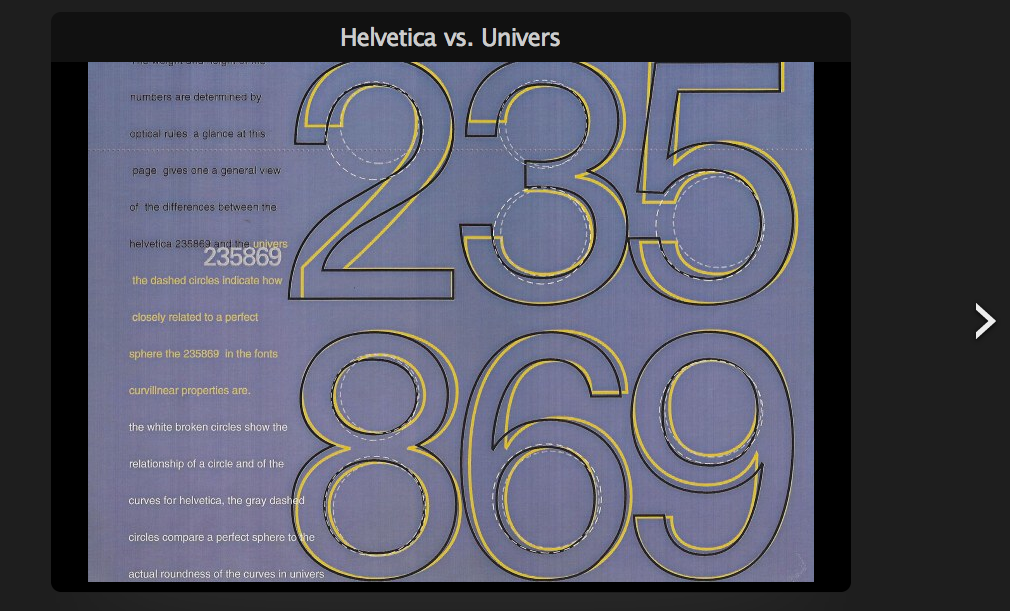
During my research on the typeface Univers for Project#2 I stumbled upon this project made by a graphic design student named Sonraya Kramer from New York. In a very Illustrative and easy to understand way, the artist demonstrates the many differences between the two similarly designed typefaces. Here are a few screenshots from the project.


The first screen shot explains the differences in the heights of the capitals as well as the stroke weight differences. The second screen shot describes the roundness and perfect circles the numbers in from Univers attempt to include in their making.

Univers/Akzidenz/Helvetica


Again, while doing research on the typeface Univers for project #2, I found a chart that depicted the differences between Univers and two typefaces similar to it. Anyone that's familiar with the typeface Univers, should be familiar with the typefaces Helvetica and Akzidenz Grotesk.

Univers was created by a French foundry in 1954. Helvetica was created by a Swiss foundry in 1957 and Akzidenz Grotesk predates both typefaces because it was created in the 19th century long before lineale typefaces became popularly used(During the 1950's and 1960's).

In fact, the creater of Helvetica based his typeface on correcting the problems that he found in the typeface Akzidenz Grotesk. Akzidenz Grotesk is known as one of the oldest known sans serifs in typographic history.

Although to the untrained eye, the differences if noticeable at all seem miniscule- the chart illustrates where the most distinguishing elements exist between each typeface.

Friday, October 15, 2010

Fontopoly


This poster was made by London based graphic designer, Timba Smits for an exhibition called, "Go Font Yourself." I wanted to do a bit of research on this poster because the way that it was created made it look like an aged boardgame from the 1950's, which is what the artist intended. I think it would be great if a board game like this really existed-I for one would purchase it instantly. The poster was designed for the fictional board game, fontopoly, which is a parody of the popular children's board game that we're all familiar with, Monopoly. With squares like Meta Street, Eurostile Station, and the Palatino Circus, this board game seems like a good representation of the varieties of typefaces that exist and the most popularly used ones like Frutiger.

Thursday, October 14, 2010

Fontstaches


I fell in love with this immediately when I found it while I was doing my daily lurking on typography blogs. I feel like this poster captures the distinctive personalities each typeface would have if it were an actual person-with a mustache!! I just think this poster was creatively made because we're all used to typestudies that show off the popular characters of the alphabet but what about the parentheses and brackets!?! This is a fun way of showing the varying stroke weights ands contrasts in each typeface. My favorite mustaches of the group include:Mr. Goudy Old Style, Mr. Didot, and Mr. Big Caslon. They seem like they would be the lives of the dinner party if there was one!

Monday, October 11, 2010

Elements of International Typographic Style


One movement I learned about through my research for Project#2, A Survey of Typographic History, was the International Typographic Style or also known as the Swiss Style. It's also known as the Swiss Style because it originated and became most popular in Basel, Switzerland. Designers most associated with this movement are Armin Hofmann and Emil Ruder.

The design pieces from this movement were minimalist, objective, and ordered in a way that made the copy compliment the accompanying image.

Elements that were emblematic of this movement at the peak of it’s popularity, mainly the 1950’s until the early 1970’s were:

Asymmetrical layouts
Strict use of a grid
Geometric abstraction in layouts
Fondness for negative space
Flush left and ragged right copy
Use of sans-serifs typefaces

Here are some examples:


Both of these posters were crafted by Armin Hofmann.

Gerald Holtom

Another discovery I made during my research on my history of typography project was about the invention of the peace symbol.

I never really thought about how the peace symbol came to be in American history, but it has a really interesting background. The peace symbol was originally designed by Gerald Holtom, a british graphic designer in 1958 for the Campaign for Nuclear Disarmament (CND). The inside of the circle is a combination made up of the semaphore letters N and D (for Nuclear Disarmament), meaning the flag signaling system.

It's interesting to see how a logo for an organization in Britain can be reinterpreted as a symbol of peace in America.

The typeface formerly known as...

While I was doing research for my project on the history of typography I discovered a lot of interesting facts about the time period I picked. Originally, I picked the 1960s-1990's because I've always had an affinity for the 1960's (minus the racial segregation and assassinations). Since I was paired up with a partner, I decided to take the first fifteen years of our time period and my partner took the later half of the period. Hopefully most of us are familiar with the typeface, Helvetica, but who really knows about the history of how this typeface came to be so universally used.


^that's helvetica.

^that's helvetica being used for all the advertisements for American Apparel stores.
Once you realize what helvetica looks like, it's really hard not to notice where it's being used.

While I was immersing myself in the history of typography I learned that Helvetica was invented in a type foundry in Switzerland by Max Meidinger in 1957. It was originally called Neue Haas Grotesk, it's maker changed it's name to Helvetica, latin for Switzerland, so that it could be more attractive to international typographic markets. Helvetica was designed as a renovation of a grotesque typeface from the 17th century called Akzidenz Grotesk. Helvetica was considered the typeface for the modern age because of the balance of counter space and positive space in each letter.


In my opinion, Helvetica is just pretty to look at :)